
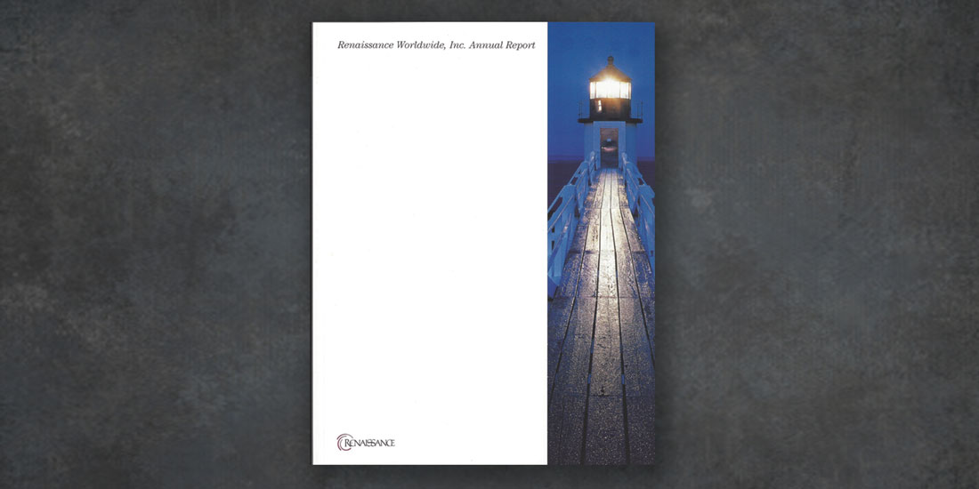
This annual report was one of the many projects that deHaas created for Renaissance, an information-technology consultancy and staffing firm. The CEO wanted this piece to project an image of solidity and vision. This lighthouse on the cover anchored the overall graphic design and conveyed a feeling of strength to investors and other stakeholders.
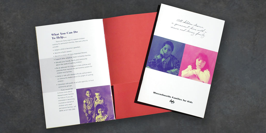
Massachusetts Families for Kids
dehaas2017-03-10T15:50:42-05:00Educational Brochure: Guiding this project was a challenge, given that this state-funded non-profit group lacked central oversight and marketing expertise. We created a brochure featuring beautiful photos of children and focusing on a universal need. The cover copy reads: "All children deserve permanent home with a secure and loving family." By appealing to readers through the faces of [...]

Global Care
dehaas2021-10-15T17:33:10-04:00Exhibit Graphic: This 8' x 15' graphic was installed at an insurance industry trade show.Global Care came to us with a request to feature a face and also provided the icons used in the graphic. The challenge was designing and producing the graphic under a very tight deadline. The client was thrilled and relieved that [...]
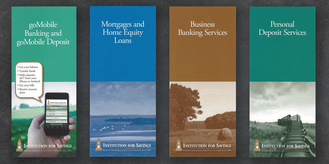
Institution For Savings
dehaas2021-10-15T17:33:10-04:00This local bank wanted to upgrade their retail image. Our graphic inspiration hung right on their walls - a sea-faring painting that perfectly reflects the bank's history in their New England seacoast community.

Instrumentation Laboratories
dehaas2017-04-12T15:51:29-04:00Instrumentation Laboratory came to us with an outdated look and inconsistently branded materials. We created a cohesive look that was applied to identity pieces, print materials, and their website.
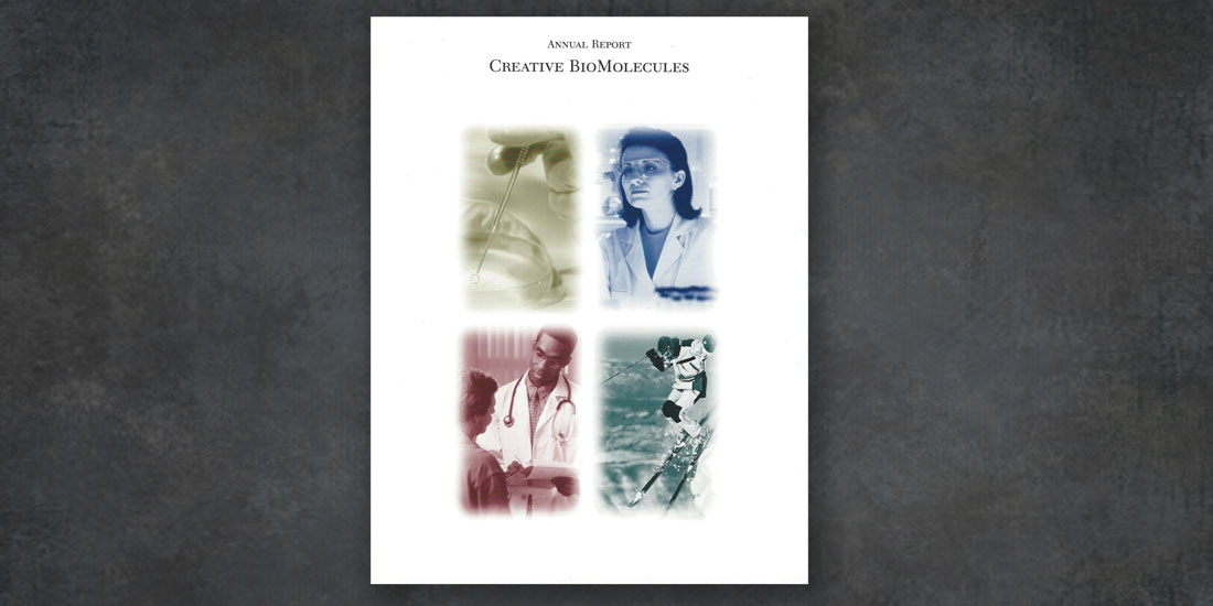
Creative Biomolecules
dehaas2021-10-15T17:33:11-04:00This client responded well to a very conversational approach to developing each year's annual report. It boiled down to asking him "What's your elevator pitch," followed by "So, how was your year," and then "What does next year look like?" Based on our discussions we were able to visually capture the company's brand, performance, and [...]

Cambridge Isotope Laboratory
dehaas2017-04-12T15:54:02-04:00When we received this job, this enormous catalog was a mess -- disorganized, drab, and low-quality. In the redesign, deHaas gave it a completely new look, with a streamlined format appealing colors, and higher quality paper stock. These changes made the catalog friendlier, nicer to handle, and easier for the customer to use. deHaas developed [...]
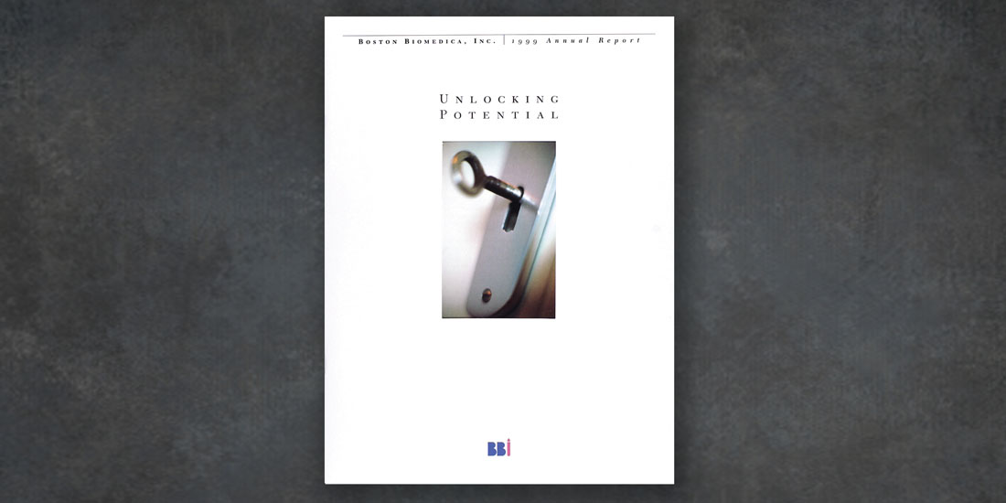
Boston Biomedica
dehaas2017-04-12T16:07:47-04:00Over the years, we worked closely with Boston Biomedica's marketing director to develop a consistent look for their annual report, marketing collateral, ads, product sheets, and exhibit graphics.
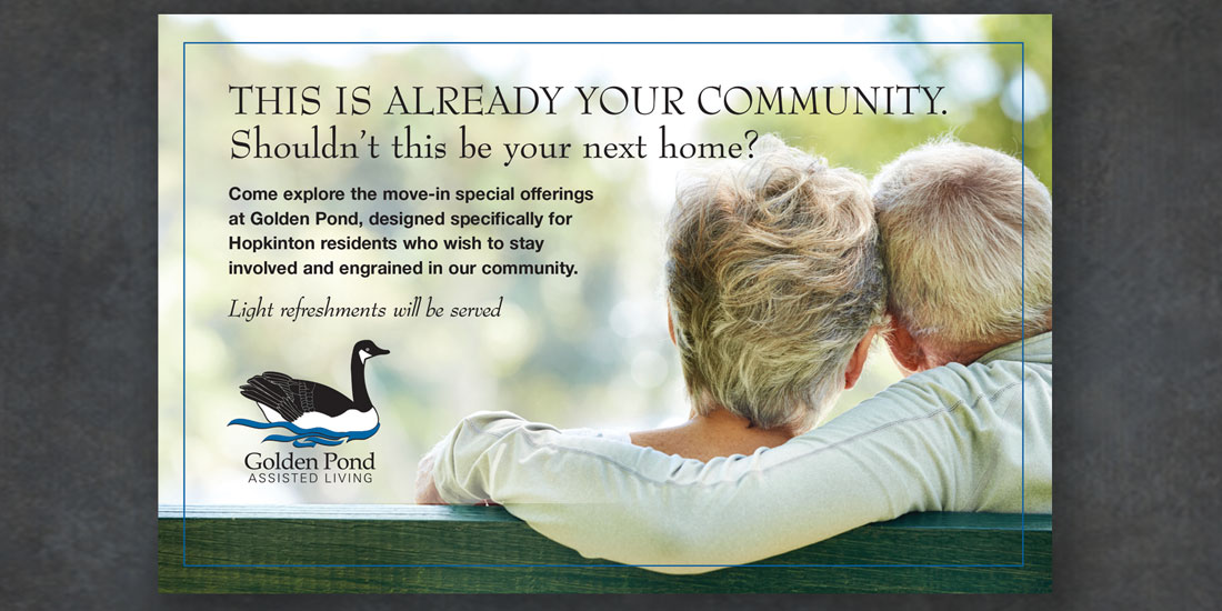
Golden Pond Assisted Living
dehaas2021-10-15T17:33:11-04:00Golden Pond wanted a look that emphasized its comfortable, supportive senior living environment. This brochure and accompanying inserts feature engaging photos of seniors in a positive atmosphere.
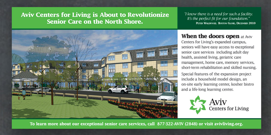
Aviv Centers for Living
dehaas2017-03-10T15:53:19-05:00Print Advertisements: This ad ran in advance of Aviv opening a new assisted living facility. As part of an overall community relations campaign, it laid the groundwork for inquiries and engagement with area seniors and their families. Direct Mail: This direct mailer was part of a campaign introducing a new Aviv assisted living facility. We [...]